Growing a new brand.
Branding and Packaging Design.
Client — Akamihk Fresh
Project Scope — Research, Brand Strategy, Logo, Packaging Design, Website, Promotional Apparel, and Marketing Collateral.
-
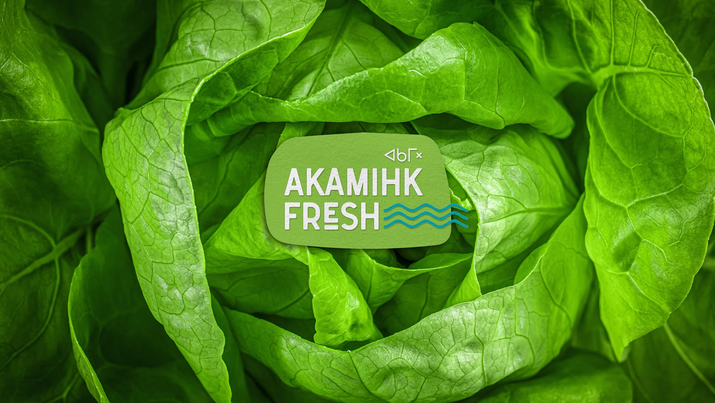
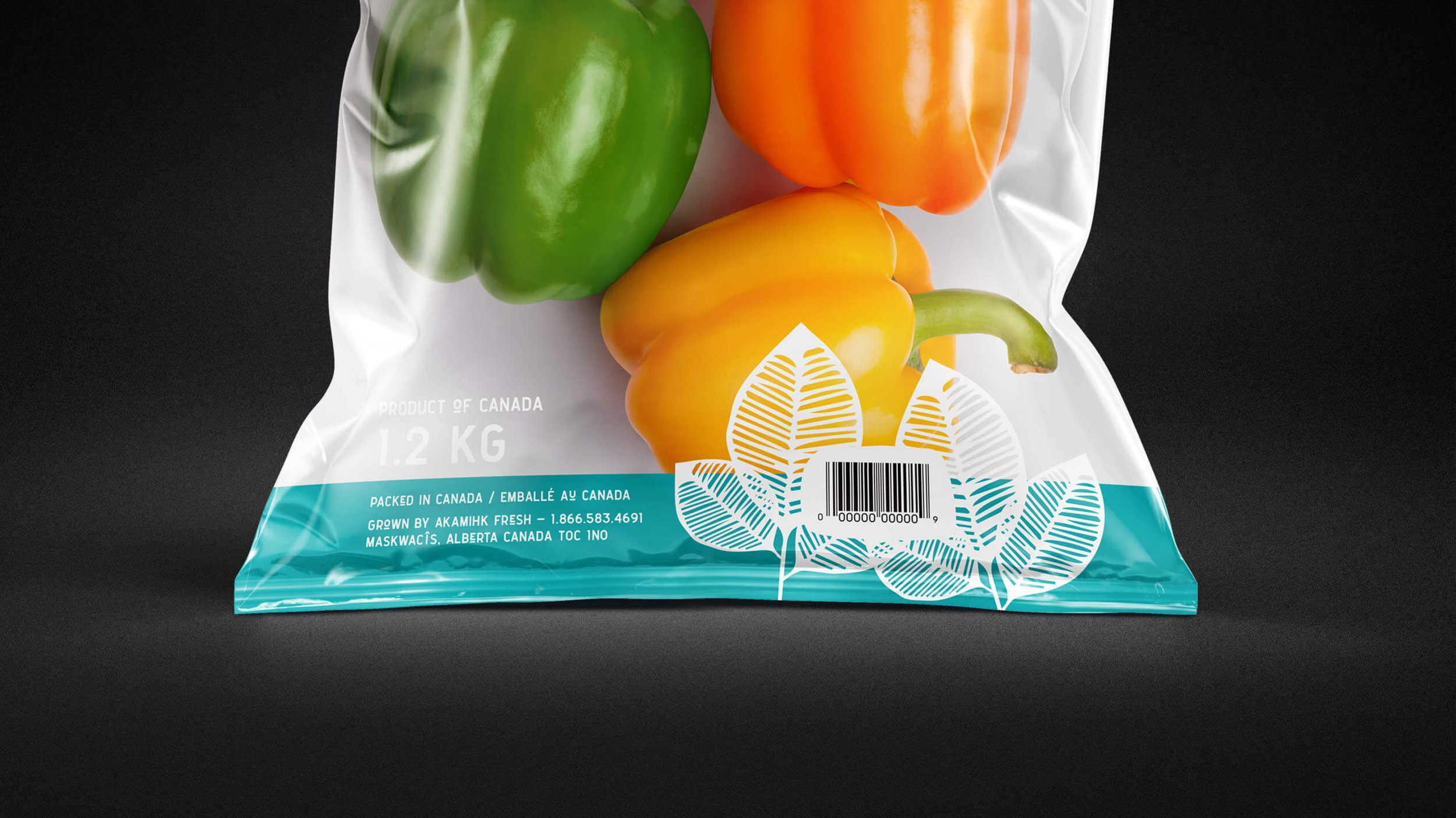
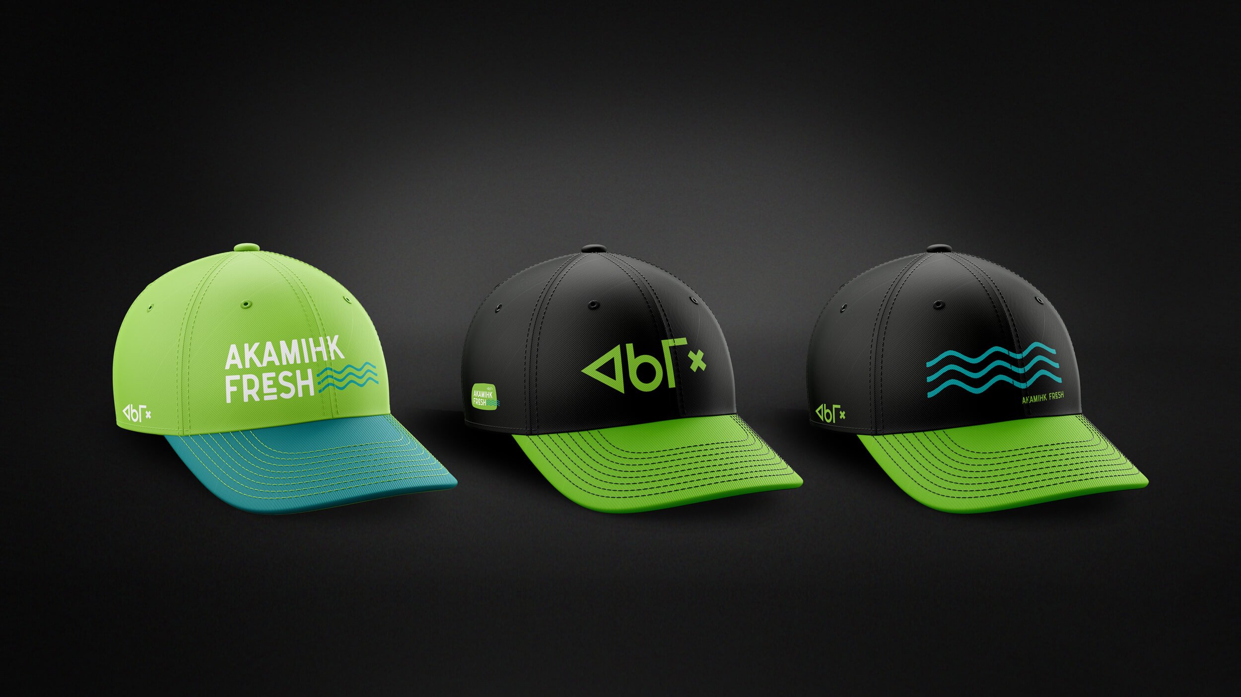
The work ‘Akamihk’ translated from Plains Cree means ‘A river runs through’, which is a perfect name for a hydroponic growing operation. The forward thinking Montana First Nation has developed a hydroponic growing facility to provide food security, healthy foods, jobs and revenue opportunities for their community. We were approached to develop a brand for the company that would position them as a trusted supplier to restaurants and develop dynamic packaging for selling their lettuces, herbs and vegetables at local retail locations. We were proud to create a logo and comprehensive brand identity for this 100% indigenous owned and operated enterprise that reflects their heritage in a clean, fresh contemporary style. The logo features a bright green pebble and teal wavy lines (symbolizing earth and the river) with Akamihk Fresh in a typeface that is organic and friendly. As they continue to grow, the brand will grow with them, keeping consistency across all marketing touch points by using additional brand elements such as the hand drawn leaf and indigenous border graphic.


