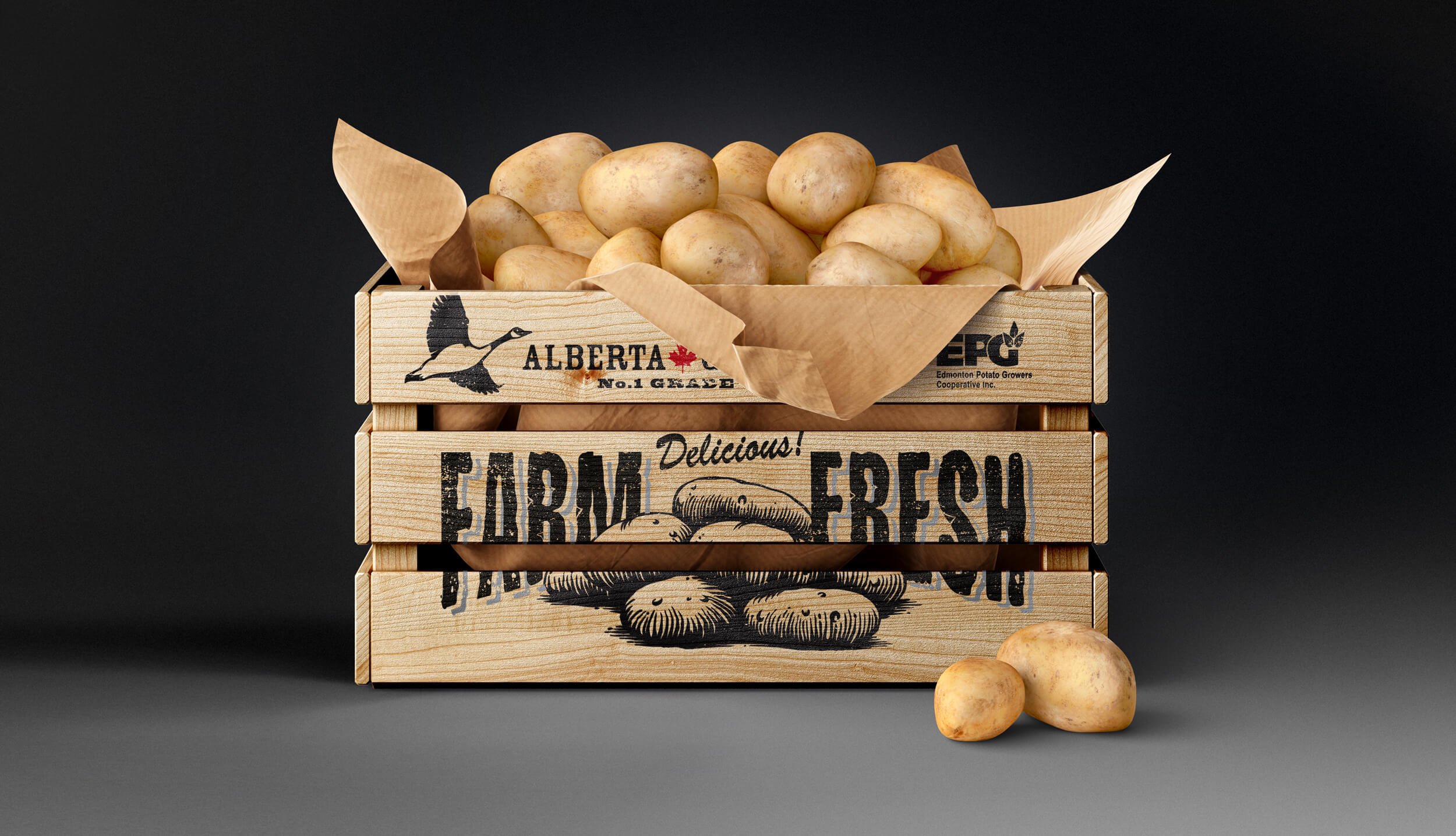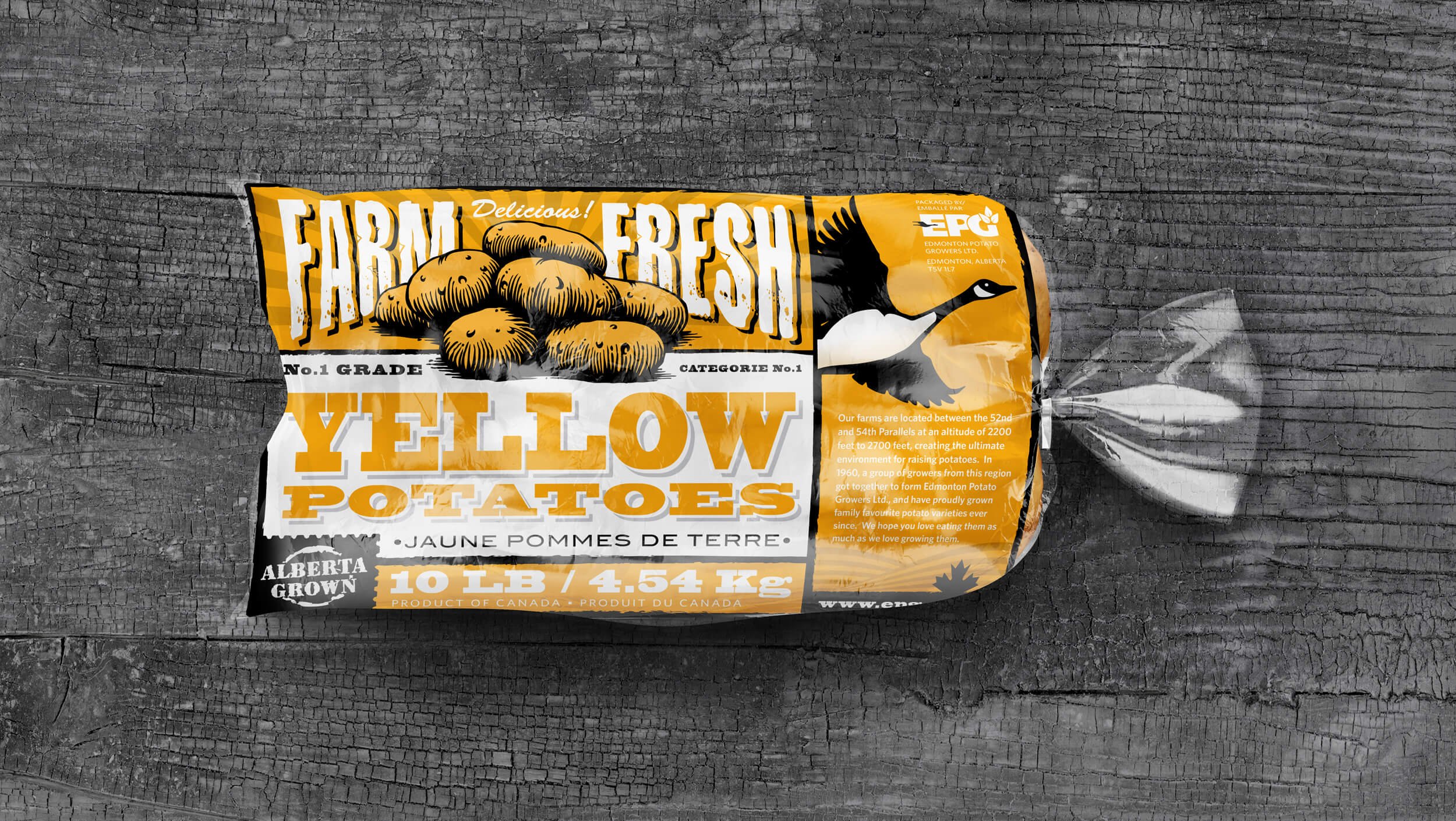
A classic retro look for farm fresh potatoes.
Potato Bag Packaging
Client — Edmonton Potato Growers
Project Scope — Research, Brand Strategy and Packaging Design.
-
One of the first projects we did with EPG (Edmonton Potato Growers) was a complete rebrand of their potato bags. As part of our listening, learning and research process we found a number of important elements that determined the design of the bags. First, they have a long history as a group of local family run potato farms that banded together to market their potatoes to the world. Second, due to the weather, soil, altitude and overall growing conditions, potatoes grown in this region are some of the best in the world - so highlighting Alberta, Canada was important. Thirdly, the bag needs to protect the potatoes from light - especially the fluorescent lights in grocery stores, as they will quickly turn the spuds green. We also did a thorough look at potato packaging from around the world, what grocery retailers were looking for, how they merchandised them, and finally, what was most important and attractive to shoppers. We explored a couple different looks, but very quickly, the hands down favourite is this retro farmer’s market style. The design reflected their history, where they’re from (with a little nod to the Canada Goose they had on their original packaging & logo), and that they are ‘Farm Fresh’ (because they are). The colour coding makes it easy to spot the kind of potato you want from a distance, and the full flood graphics on the top of the bag protect the taters from light exposure. And not insignificantly, the flat illustrative approach kept printing costs down by only using 3 colours.
The bags look great in the grocery store to this day, and for a commodity item like potatoes, packaging is key when shoppers are making their in-store purchasing decisions.


